The Effects of Vaporized
Vaporized was a fun project for me because I don't usually do a lot of visual stuff, but I am familiar with a bunch of different techniques that I don't actually see get used too often, so it was nice to be able to flex a little. These techniques are much simpler than you would think; I just ended up using a lot of different ones together. The design approach was to come up with a lot of bespoke one-off systems for particular effects, rather than finding a one-size-fits-all solution, which is something that would likely be unsustainable for a larger project but was perfect for making a jam game "pop" because it meant I didn't have to spend a bunch of time making robust systems that were only going to be used in one place.
The Lighting
(A note going forward - the base resolution of the game is 320x180 so all images in this post will be blown up 3x to make the details more visible at modern desktop resolutions)
This is the main effect in the game and something that feels surprisingly underused in games considering how simple it is to implement. The basic technique is something I learned years ago from a devlog for the game Legend of Dungeon, although my version is a bit more complex because I used normal maps instead of height maps. This works perfectly well with the base Sprite Renderer component in Unity, including animating by changing the sprite in the renderer (so long as you make sure all your sprites are on one sheet that has an associated normal map), the only thing you really need to do is create a custom material since the default sprite material is unlit. As I'll get into later, I also wrote a custom shader rather than using the default cutout shader that comes with Unity, but the basic functionality is nearly identical, I just wanted my own lighting function and the special transition effects.
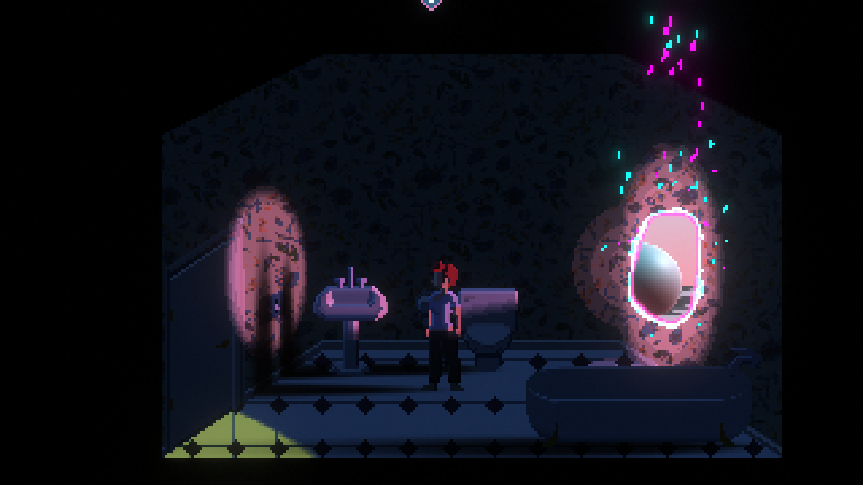
The actual base scene, with all lighting disabled and ambient light set to pure white, looks like this:
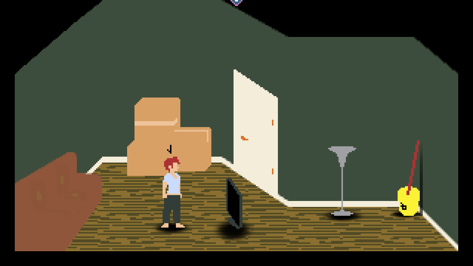
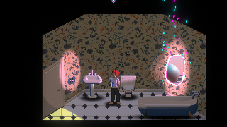
There's no "baked in" shading at all! The sprites are just solid colours and the shadows are simple drop shadows from projectors (I am also just noticing for the first time that the drop shadow is misaligned under the TV - I guess the nice thing about the room being mostly dark is this isn't very noticeable in the actual game). However, the scene is not actually as flat as it appears here. This is what the room looks like when viewed in the editor:
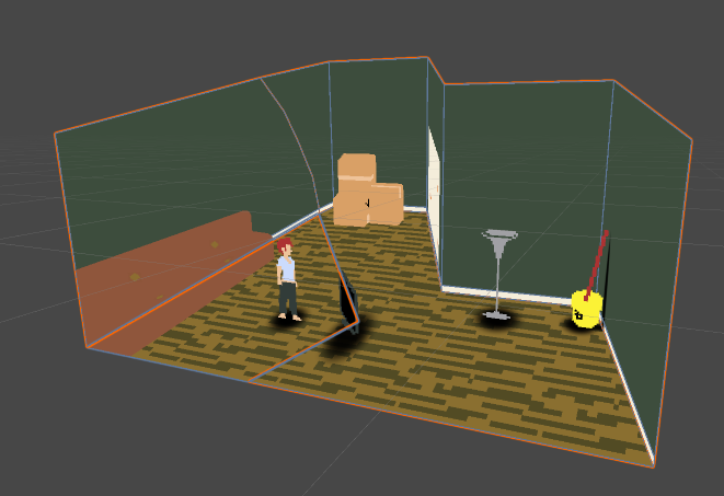
This wonky shape was needed because to keep the sprite sizes consistent regardless of depth, an orthographic projection is needed, but I wanted the scene to have the appearance of perspective, so it's essentially a hand-modelled perspective projection, viewed orthographically. The room geometry then has a special shader it uses to determine how it gets its uvs - instead of using the UVs from the mesh itself, it uses the world x and y coordinates of the current fragment (world coordinates have a 1:100 correlation with pixels on the screen i.e. every 1 world unit will be exactly 100 pixels up/across on screen, so the value is divided by 100 before sampling from the texture). The effect this has is that the textures on the world geometry will always "face forward" - that is, they will essentially just apply the texture over themselves as if it was a billboard rather than distorting it based on the angle of the face relative to the camera (assuming the camera is aligned to stare directly down the z-axis. There is another version of this shader that will work from any angle because it's based on sampling the viewport position rather than the world position but it's overkill for what I was doing). This makes the pixels always look exactly as they did in the sprite editor and gives it a cleaner "hand drawn" look, and more importantly, makes it visually cohesive with the sprites. There are a couple exceptions to this - the couch and baseboard use standard texture uvs because their awkward screen angles would have made hand-drawing a front-facing texture for them a real pain, especially considering how simple they are.
This approach has a few downsides - because the ground and walls are on a funny angle, the way lighting interacts with them can look odd if you don't get the alignment and ranges correct - things like light visibly fading the farther along a wall you get because the "south" end of the wall is technically farther away from the middle of the room than the "north" end. It also makes placing objects in the scene difficult because you can't simply align them with y=0 or whatever for the "floor", you need to eyeball it and just move it up until it doesn't clip through the geometry anymore. In the future I'd like to toy with ways to dynamically scale sprite size based on distance from the camera, so I could have a perspective projection camera and just have the 3D room be the proper shape, but for the purpose of the jam this was quicker and the downsides weren't a huge problem.
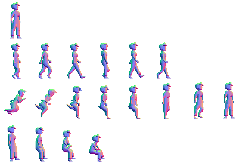
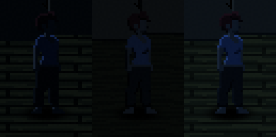
The upside to this approach is that having an actual 3D space allows for much more interesting dynamic lighting than you might get if you just put your lights in a flat 2D scene, since you can have lighting coming from behind or in front of an object rather than simply the sides. This is why I went with normal maps instead of height-maps - you need a lot more detail if you want the lighting to look right from any angle. This is what the normal map for the main character looks like:
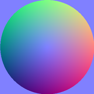
To draw the normals I didn't really do anything special - Aseprite has a built in "normal map" colour wheel, where the trick to using it is to visualize the circle as being a sphere and the angle a point would have on a sphere is represented by the colour at that point:
There are tools that will make doing this easier - I tried out Sprite Illuminator but did not end up using it for much (the only object that was done in Sprite Illuminator instead of fully by hand in Aseprite was the bathtub). It came down to the fact I'd already mostly figured out how to do them by hand, pixel by pixel, so I didn't really have time to relearn how to use SI to get the results I already had; if I reuse this technique in the future I will probably make a more serious go at using Sprite Illuminator because it can significantly streamline the process. Drawing the normals themselves just comes down to having a good sense of what 3D shape your sprite work represents (it's helpful to start at the outlines and work inwards), and then a bit of trial and error as you import the normals into the scene, see how the dynamic lighting reacts to it and keeping an eye out for any weird stray pixels, and making corrections until it looks good enough. Setting up a simple script that makes a directional light constantly rotate is handy (this is what the "disco mode" easter egg mentioned in the walkthrough is).
Once you have the normal map and sprite sheet set up, you are pretty much done as far as lighting sprites goes - the functionality is all pretty standard and very easy to make work in Unity, although if you are using the default Unity shaders you might not be particularly thrilled with the results - they are, after all, designed for high res textures on 3D objects, not pixel art, and they have a lot of non-intuitive lighting effects that aren't really appropriate for this style. For this jam I used a tweaked version of Xibanya's toon shader from her shaders for people who don't know how to shader series; what you tend to want for a more "pixel art" look is a harder line between light and shadow so toon shaders are ideal for this. The main tweak I made to the shader (aside from the transition stuff which will come later) is that the attenuation in the lighting function is modified with the following code snippet:
atten = smoothstep(0, .2, atten*2);
half modAtten = round(atten * _ToonAttenMod) / _ToonAttenMod;
modAtten = min(modAtten, 1);
c.rgb = s.Albedo * _LightColor0.rgb * modAtten * shadowColor;
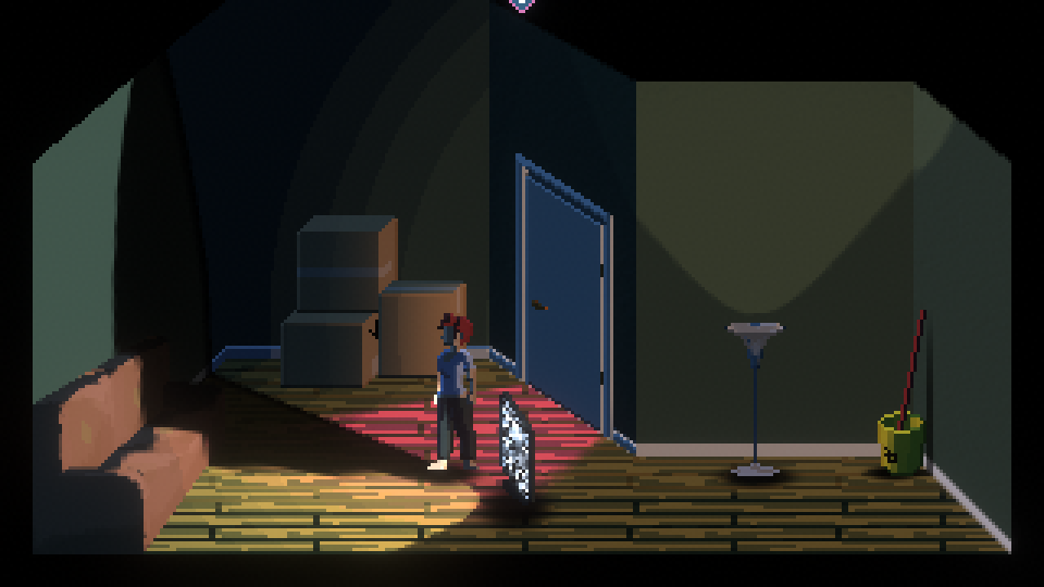
If this doesn't make sense to you, the short version is that what it does is changes the way lighting is calculated over distance, where rather than a smooth falloff from the origin, it stays near max intensity for most of the light's range, then falls off with discrete colour bands towards the edges. The _ToonAttenMod value is an integer and will dictate how many discrete bands there will be (including the main maximum light area) - in the game I settled on 5 for this. This is most visible on point lights rather than spot lights, seen with the lamp light here:

A thing you might notice in this screenshot is despite being a neat effect, it doesn't really give the scene much depth - the lighting on the front of the lamp, for example, is completely flat, because the actual location of the light source in the scene is behind it. Ambient light doesn't fix this, because ambient light applies to all surfaces equally, which is why the first screenshot is also completely flat looking despite having the ambient lighting set to maximum. For Vaporized, I actually don't use ambient light at all (it's set to pure black), and instead use directional lights as "ambient light" - there are two directional lights in the scene (actually three but this is related to the transition effects and we'll get to it later), both coloured the same dark blue - one angled so that it's coming down from the back top-leftish, and another, half-intensity light angled coming down from the front. This gives the sprites a "backlit" look that makes for nice looking darkness and helps them stick out from the background.
All these lights remain active in the scene at all times so colour choice with lighting is very important here, since these dark blues are going to be blending with the other lights in your scene - this is why the lamp only screenshot above has a much more orange look than the lamp in the actual game - because the in-game lighting colour is that orange light + the dark blue ambient lighting. If you want to get fancy, you could set up a script that modifies the ambient lighting to more closely reflect the general light levels in the room, or dims the ambient light to black when lights are on to avoid interference (I did actually write code for this in the game but only used it for the initial fading in of the ambient lights when you first turn the TV off), but it will make lighting your scene a bit more difficult overall since you won't have a fixed baseline to work from. I don't really have any particular advice for lighting a scene because it's way outside my wheelhouse and my approach was essentially "yeah that looks about right". One piece of advice I will give, and this is more personal preference than any sort of hard and fast rule, is that I have noticed a lot of games with fancy effects like this have a bad habit of overdoing them, because they want to show off their fancy effect, and just throw a million lights into the scene rather than making deliberate aesthetic choices about their placement. My goal was to try to more closely emulate how a classic VGA/SVGA era adventure game actually looked, but with effects that would not have been possible on the technology of the time, and I feel that trying to shoot for a specific aesthetic is more important than showing off the engine.
The Shadows
The shadows in the game are extremely simple - dynamic shadows are actually possible with this dynamic sprite lighting technique, but they require a bit more work and put some limitations on your lighting - any shadow casting lights will have to come from mostly in front of or behind your sprites because remember that they are 2D objects and they have no depth, so a shadow caster coming at them straight from the side will just project a line on the ground unless you get *really* fancy and set up some kind of hidden side-facing sprite as a shadow "hint". So rather than being truly dynamic, it's just a bunch of simple projectors casting circles out at various angles and distortions. In the bathroom there are two projectors per object, one basic top-down drop shadow, and one mostly side-facing "long" shadow. Turning the light on or off in the room will swap which of these projectors is active, to represent the primary light source changing between the portal on the wall or the light on the ceiling.
The shadow cast from the TV is essentially this same principle, but turned up to 11 - there is a projector rooted on the TV that dynamically points to the protagonist's feet, and widens its projection angle based on the distance of the character from the TV, so as you approach the TV the shadow gets significantly larger, representing the character blocking more of the light.
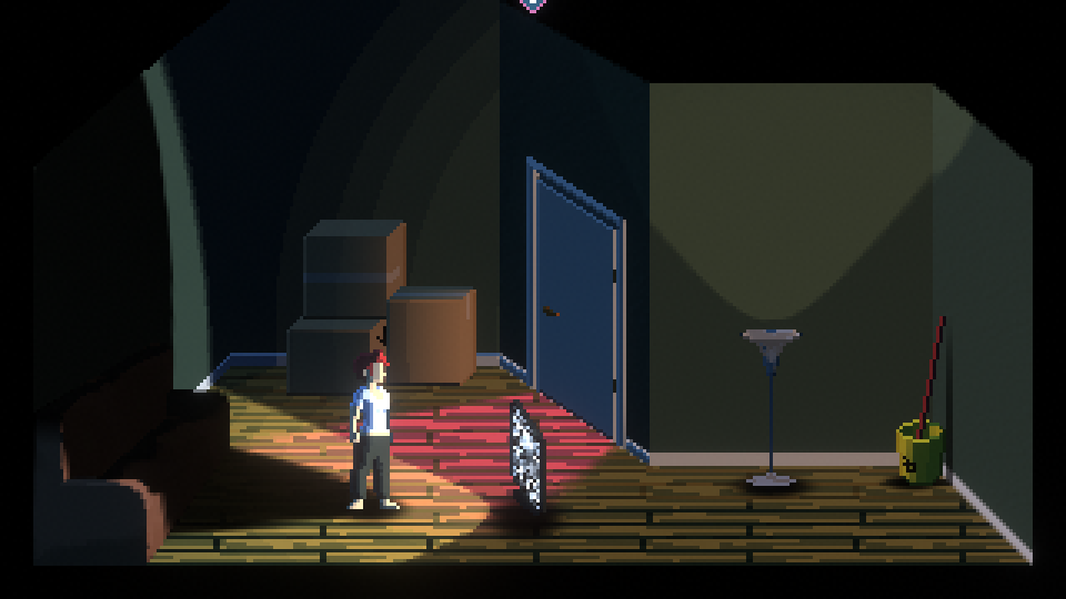
I had to tweak the drop shadow texture a bit for this, because if you try to project a basic circle, making it align properly makes the math a lot more complicated (because you want the edge of the circle to sit at the character's feet, meaning a projected circle will need to have its target offset to a point somewhere halfway between the TV and the protagonist rather than just pointing at the protagonist - and remember the floor is not flat), so instead it's an oval shape that only covers half the texture, but it gets so distorted by the changes to the aspect ratio and projection angle that it's functionally the same as all the other projectors.
One major issue with using projectors instead of dynamic shadows is that projectors don't know what "lighting" is, and will apply to everything in the scene regardless of how lit/unlit that area already is. This is a problem for the TV light because if you recall, it is rooted on the TV and always points at the character - so what happens if you walk behind the TV? Well, it'll just project the shadow backwards, even though you aren't standing in the light anymore. This is what those weird seams on the wall and floor earlier were about - this is a special cut out area of the geometry which is put on its own layer, and the TV shadow projector only casts to that layer, so when you walk outside the light, the shadow just cuts off where you would expect it to. This is not a perfect solution, because the shadow will still cover spots within the cutout area even if those spots would be lit by other sources, leading to a very visible unnatural cutoff line:
This ends up not really being an issue in Vaporized, because players are most likely to only see the TV shadow in the opening scene where the rest of the room is pitch black and this line is therefore not visible; this is the main trick to the every-effect-is-bespoke approach - just be smart about where you use them and how to hide their shortcomings.
The Transition
This is the other main "big" effect in the game, aside from the lighting, and is actually extremely straightforward to do in a shader, it just requires a bit of foreknowledge that you will be building your game around this concept. The basic concept is essentially the same as a dissolve shader - there is a global "threshold" value between 0 and 1 that gets set based on how much of the current room has been "Vaporized", and this value is used to determine which of two textures should be displayed at every point on the screen. What makes the effect look fancy is that there is a special "transition" texture for the room itself, and every object in the room, that uses black to white to dictate how it should "animate" based on what the threshold is currently set to. This is what the transition texture looks like for the bathroom:
And this is the living room:
These were both just me literally drawing over a screenshot of each room by hand, using 50 evenly spaced (ish - 50 doesn't divide nicely into 256 which is the greyscale range you have to work with in 32 bit colours, and it was a thing where 32 was not quite enough while 64 was too much for my poor hand. I don't have a tablet this whole game was done with a mouse) shades of grey from black to white, where black is where the transition starts and white where it ends, then blurring the image so it would animate more smoothly. You might notice some odd shapes in the bathroom - those are remnants of earlier versions of the layout that I didn't actually end up using, and I just left them in because they made the pattern of growth more interesting than just expanding linearly out from the portal.
What the shader will do is for every pixel on an object, it will figure out where on screen that pixel will be drawn, and then sample the pixel at the same position in the transition texture for the current room. If the value of the colour on that transition texture pixel (specifically, the red channel, but since it's greyscale, R, G and B all have the same value anyway) is greater than the current threshold value, it will display the pixel from the object's "normal" texture, while if it's less than the current threshold value, it will display the pixel from the object's "vaporland" texture (for the main room geometry, the "vaporland" texture is just a rendertexture from another camera pointing at custom environment, placed on a billboard behind the 3D room and clipped based on the transition threshold). There is a bit extra happening in here to make it more visually interesting - it applies a bit of distortion to the threshold value based on a sin wave and time, and the x and y position on screen, so the line appears to fluctuate a bit rather than being static, and for values very close to the threshold, it sets the emission colour on the texture to cyan or magenta (depending on what side of the line it's on and how close it is) to give the transition line that nice "glowing" effect.
This transition texture is used to determine how to display the room geometry and the main character, but individual objects have their own transition textures, which allow them to animate slightly out of sync with the main room and give more of a sense of the "3D-ness" of the effect by making it seem like it has to "climb up" from the floor rather than simply wiping across the screen.
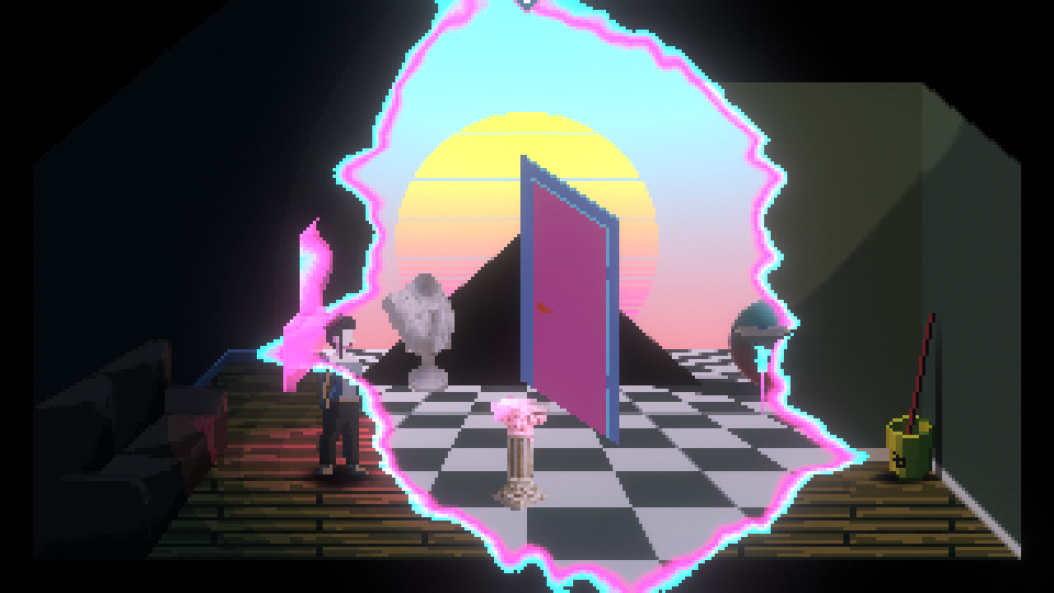
In the above screenshot you can see that the character graphic aligns perfectly with the room transition, but the lamp and TV/Pedestal are a bit behind, while the boxes are a bit ahead. The object transition textures are very simple and I won't even bother posting any here because they will just look pure black - they actually have a very small range of very very dark greys that get used as an "offset" against the current threshold value, and then each object has a manually set value dictating what threshold it should start to transition at. So the logic then becomes "compare the current threshold value to the object's base threshold value + the red channel of the texture at this pixel position", hence why they are mostly almost black - anything too light and the object would end up needing thresholds greater than 1 to fully transition.
Finally, the objects that exist in "Vaporland" are actually on a separate layer from the main game objects, which allows me to use different lights to target them. This is where the third directional light comes in - it's the single light source that lights up all of the Vaporland objects, both in the rendered environment and the main game. Most of the Vaporland objects do not have normal maps - they are just scaled down jpegs of photos with all the shading from the original image. This was mostly a decision made out of laziness but I feel it also works thematically to give them a sense of "otherness" that they basically have completely different lighting rules than the rest of the game. The protagonist is still dynamically lit, even in Vaporland, although the single light source means that her Vaporland appearance looks a bit more "two-dimensional" than her "real world" one.
The Title
This was actually the first effect I did despite it coming last in this devlog, it was the result of some pre-jam experimentation with shaders I was doing (I basically only learned how to do shaders like two weeks before this jam started, hence why my lighting function is built on Xibanya's tutorials - that's what I was doing leading up to the jam!). I had a basic idea in my head that I wanted to do some kind of pouring in/smearing out effect, where the pixels would slide across the screen into place, and what I arrived at was a completely different thing I mostly stumbled upon by accident.
On top is the effect I was originally aiming for (which I later repurposed for the "pouring out" effect by changing it to the y-axis and running it in reverse), on the bottom is one I got when messing around with trying to create a "stitched" version that poured in from the bottom and side simultaneously. The way this shader works is that essentially every pixel in the texture is given an "offset" value where instead of drawing what would be at that uv coordinate, it jumps over to another part of the texture and draws that pixel instead. The smearing effect happens because this offset is not uniform - it's based on proximity to a threshold value where if the x-coordinate is lower than the threshold value, it just draws the pixel at the non-distorted uv-coordinates from the texture, but if it's higher, then it will sample over somewhere near-ish to the threshold, essentially taking a small area just past an invisible line on the image and stretching it across the rest of the texture. The threshold value is also modified by the y-coordinate of the texture, meaning that it pours in at a bit of an angle rather than straight across the image. The whole thing then gets animated by just changing the threshold over time, dragging it from 0 to 1.
The stitched version is doing essentially the same thing, but it is warping both across the x-axis AND the y-axis, and has different sampling targets based on a checkerboard pattern across the image (which is produced just by doing modulo 2 on the x and y screen coordinates). This has the effect of basically layering two distinct effects on top of each other that will get closer to each other as they approach the threshold value, and playing with the inputs of the shader will change how those specific effects animate. Playing with the numbers got me to the effect in the video above, which I would describe as "pouring paint over the letters as they are being built" and I think it looks neat.
Conclusions
Having read back through this postmortem I feel like the main throughline for most of the effects in this game is the realization that you can just get pixels from wherever you want, man. Textures and meshes and lighting are really just suggestions being passed along to the graphics engine, your shaders can manipulate them or replace them or just completely ignore them.
To close out this post, I will include the shader code for the stitching effect on the title. It's actually quite short, and the pouring version is an even simpler version where you just cut out all the bits that modify the y-value, and chop off the bit at the end that assigns modx or basex depending on the screen pixel (you just pass in modx directly to uvModified):
Shader "Unlit/Stitch"
{
    Properties
    {
        //The main texture will need a 1px transparent border and the wrap mode set to Clamp for this to work correctly
        _MainTex ("Texture", 2D) = "white" {}
        _Color("Color", Color) = (1,1,1,1)
        //This shader is animated by moving the Pour Threshold between 0 and 1
        _PourThreshold("Pour Threshold", Range(0,1)) = 0
        //Pour Power will give the shader more "skew". It is hard to describe, just mess around with it and see what happens
        _PourPower("Pour Power", Range(0,2)) = 1
        //Pour Blend determines how far "ahead" of the pour threshold the shader should sample from and stretch this across the rest of the image. Setting this to 0 will make the entire rest of the row fill with one colour
        _PourBlend("Pour Blend", Range(0, 0.3)) = 0
    }
    SubShader
    {
        Tags { "RenderType" = "Transparent" "Queue" = "Transparent" }
        LOD 100
        Cull off
        Blend SrcAlpha OneMinusSrcAlpha
        Pass
        {
            CGPROGRAM
            #pragma vertex vert
            #pragma fragment frag
            #include "UnityCG.cginc"
            struct appdata
            {
                float4 vertex : POSITION;
                float2 uv : TEXCOORD0;
            };
            struct v2f
            {
                float2 uv : TEXCOORD0;
                float4 vertex : SV_POSITION;
                float2 screenPos : TEXCOORD2;
            };
            sampler2D _MainTex;
            float4 _MainTex_ST;
            half4 _Color;
            half _PourThreshold;
            half _PourPower;
            half _PourBlend;
            v2f vert (appdata v)
            {
                v2f o;
                o.vertex = UnityObjectToClipPos(v.vertex);
                o.uv = TRANSFORM_TEX(v.uv, _MainTex);
                o.screenPos = ComputeScreenPos(o.vertex);
                return o;
            }
            fixed4 frag(v2f i) : SV_Target
            {
                half PourTargetx = lerp(-_PourBlend, 1 + _PourBlend, 2 * _PourThreshold - (1 - pow(i.uv.y, _PourPower)));
                half PourTargety = lerp(1 + _PourBlend, -_PourBlend, 2 * _PourThreshold - pow(i.uv.x, _PourPower));
                half modx = i.uv.x * step(i.uv.x, PourTargetx) + min(lerp(PourTargetx, PourTargetx + _PourBlend, smoothstep(PourTargetx, 1 + _PourBlend, pow(i.uv.x, _PourPower))), i.uv.x) * step(PourTargetx, i.uv.x);
                half mody = i.uv.y * step(PourTargety, i.uv.y) + max(lerp(PourTargety - _PourBlend, PourTargety, smoothstep(-_PourBlend, PourTargety, pow(i.uv.y, _PourPower))), i.uv.y) * step(i.uv.y, PourTargety);
                half basex = i.uv.x;
                half basey = i.uv.y;
                //change these from halfs to ints and you will get a stitching effect where the pixels come directly from the bottom and right
                half screenPixelx = i.screenPos.x * _ScreenParams.x;
                half screenPixely = i.screenPos.y * _ScreenParams.y;
                //If you only want the basic one-side smearing effect, just assign modx directly to x and basey directly to y
                half x = basex * fmod(screenPixelx + step(1,fmod(screenPixely, 2)), 2) + modx * (1 - fmod(screenPixelx + step(1, fmod(screenPixely,2)), 2));
                half y = mody * fmod(screenPixelx + step(1,fmod(screenPixely, 2)), 2) + basey * (1 - fmod(screenPixelx + step(1, fmod(screenPixely,2)), 2));

                half2 uvModified = half2(x, y);
                // sample the texture
                fixed4 col = tex2D(_MainTex, uvModified) * _Color;
                return col;
            }
            ENDCG
        }
    }
}
Comments
Log in with itch.io to leave a comment.
Very neat and detailed. Thanks for sharing your process with us.